Data visualization with ggplot2#
The package ggplot2 has a specific grammar for data visualization which uses three main entities:
the data: the data frame that contains the data that we want to plot
the aesthetics: the variables in the data that we want to be the dimensions of the plot (i.e. the x and y dimension, but also the color if we want to color-code according to a variable)
the geometric object (geom): specifies the type of plot we want to make (a scatter plot, a boxplot, an histogram, etc.)
The general notation of a plot is (DON’T EXECUTE):
ggplot(data,aes(x=aesthetic_1,y=aesthetic_2)) +
  geom_*()
Let’s see a basic example. We’ll use the iris dataset as the data and will plot a scatterplot (that is the geom) with Sepal.Length and Petal.Length as the x and y dimensions (that is the aesthetics):
ggplot(data=iris,aes(x=Sepal.Length,y=Petal.Length)) +
  geom_point()
You can have a look to the Data Visualization cheatsheet (https://rstudio.com/wp-content/uploads/2015/03/ggplot2-cheatsheet.pdf) which is a good one-page summary of the main functions.
Aesthetics#
We can add more aesthetics than just the x and y dimensions. For example we can plot the information of a 3rd variable (Species for example) as the color of the dots, or as the shape. ggplot2 will handle it easily and will produce a legend automatically:
ggplot(data=iris,aes(x=Sepal.Length,y=Petal.Length,col=Species)) +
  geom_point()

ggplot(data=iris,aes(x=Sepal.Length,y=Petal.Length,shape=Species)) +
  geom_point()
Geometric objects#
We can tune the type of plot by choosing the appropiate geometric object. Let’s make an histogram and a boxplot of the sepal length by species. You will have to change the aesthetics accordingly: note that the histogram won’t need a y aesthetic and the collor is defined with fill (instead of col).
ggplot(data=iris,aes(x=Sepal.Length,fill=Species)) +
  geom_histogram()

ggplot(data=iris,aes(x=Species,y=Sepal.Length,fill=Species)) +
  geom_boxplot()
Other layers#
We can further tune the plot by adding more layers that will add new features to the plot.
First, we’ll see how we can add a linear fit to the scatter plot:
ggplot(data=iris,aes(x=Sepal.Length,y=Petal.Length)) +
  geom_point() +
  geom_smooth(method="lm")
We can re-write the axis labels and add a title and subtitle:
ggplot(data=iris,aes(x=Sepal.Length,y=Petal.Length,col=Species)) +
  geom_point() +
  geom_smooth(method="lm") +
  xlab("Sepal length (cm)") +
  ylab("Petal length (cm)") +
  labs(title="Fisher's or Anderson's iris dataset",subtitle = "Content: 50 flowers from each of 3 species of iris")
We can also tune the general style of the plot by setting a different theme:
ggplot(data=iris,aes(x=Sepal.Length,y=Petal.Length,col=Species)) +
  geom_point() +
  geom_smooth(method="lm") +
  xlab("Sepal length (cm)") +
  ylab("Petal length (cm)") +
  labs(title="Fisher's or Anderson's iris dataset",subtitle = "Content: 50 flowers from each of 3 species of iris") +
  theme_minimal()

ggplot(data=iris,aes(x=Sepal.Length,y=Petal.Length,col=Species)) +
  geom_point() +
  geom_smooth(method="lm") +
  xlab("Sepal length (cm)") +
  ylab("Petal length (cm)") +
  labs(title="Fisher's or Anderson's iris dataset",subtitle = "Content: 50 flowers from each of 3 species of iris") +
  theme_classic()
Finally, we can easily more than one plot with a single ggplot command if we can split the dataset according to a variable, for example the Species:
ggplot(data=iris,aes(x=Sepal.Length,y=Petal.Length,col=Species)) +
  geom_point() +
  geom_smooth(method="lm") +
  xlab("Sepal length (cm)") +
  ylab("Petal length (cm)") +
  labs(title="Fisher's or Anderson's iris dataset",subtitle = "Content: 50 flowers from each of 3 species of iris") +
  theme_minimal() +
  facet_wrap(~Species)
Exercises#
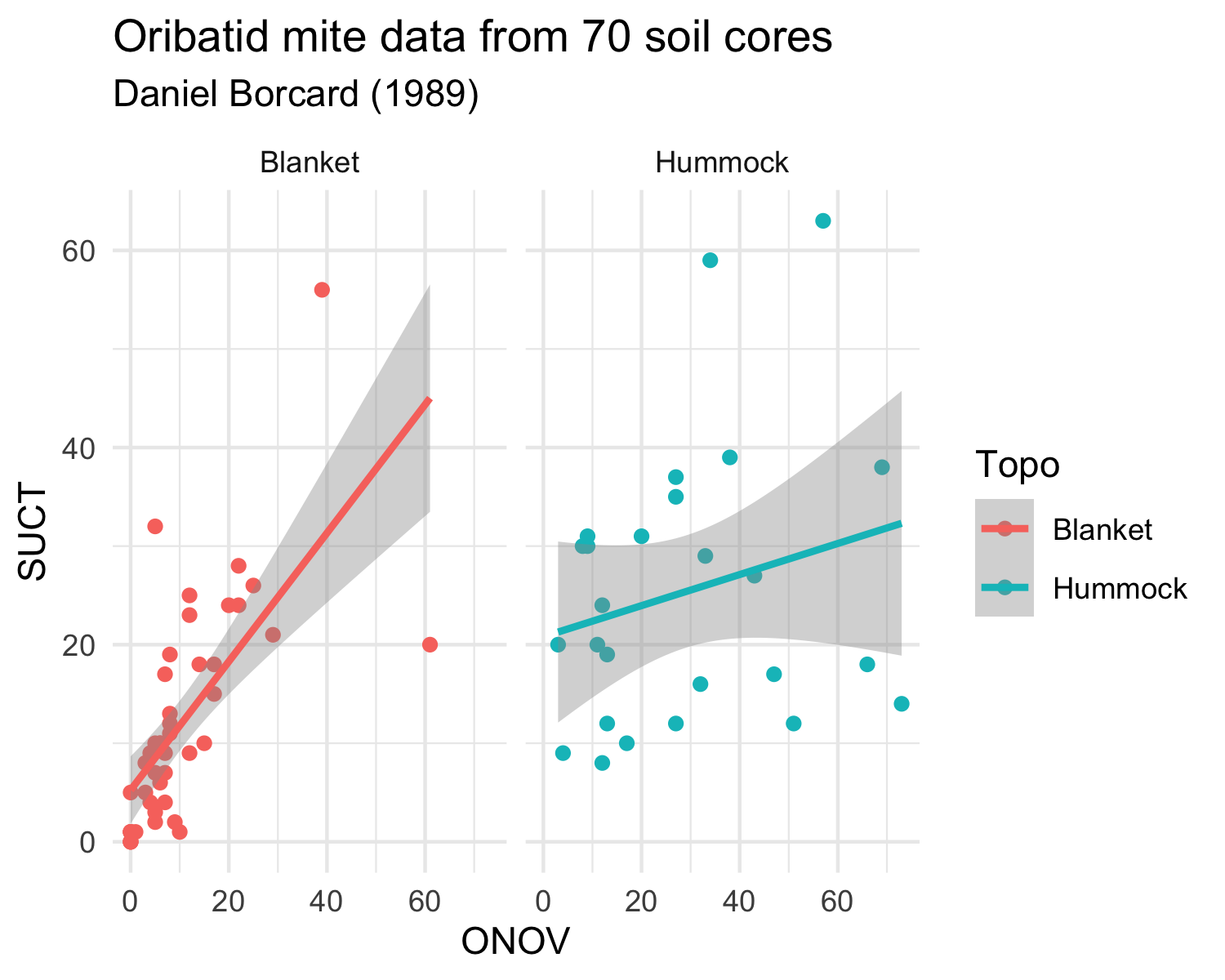
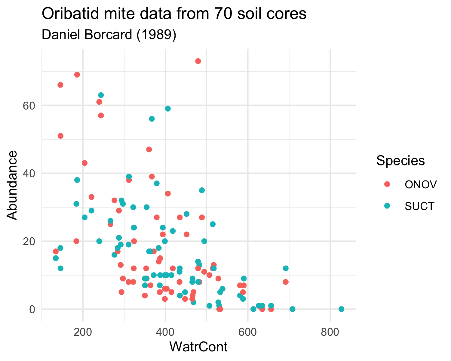
Load the mite and mite.env datasets from the vegan package and try to reproduce the two following plots.
The mite datasets are similar in structure to the dune dataset that we have already used. It contains information on Oribatid mite data from 70 soil cores collected by Daniel Borcard in 1989. The mite data frame contains the species abundances and the mite.env contains environmental information.
Note that you will have to transform the data differently for each plot.
Plot 1:

Plot 2:
