Introduction to linear regression
Linear Regression
R also has inbuilt functions that allow you to fit your data to a defined model. For example, lm fits a linear model determined by a formula provided. Check out the documentation to find out what arguments you need.
#get documentation
?lm
#linear model of the form y = m*x +c
fit <- lm(Sepal.Length ~ Petal.Width, data = iris)
To get the output of the fit use the summary command.
summary(fit)
Basic Plotting
Frequently, you will want to visualise your results. For example, we would now like to plot the linear regression fit we calculated before.The most basic plotting function in R is plot. It has many adjustable parameters which makes it a great tool to construct your plot just as you like it. First, have a look at all the possible arguments for plot.
#get documentation
?plot
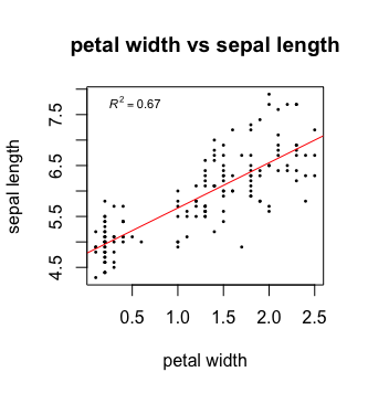
Then, we plot the petal width on the x axis against the sepal length on the y axis. Plot will automatically name the axis according to the input data but you can easily change the names of the axis. We will also give our plot a title to keep things nice and tidy.
#plotting
plot(iris$Petal.Width, iris$Sepal.Length,                   #define data to be plotted
     xlab = "petal width", ylab = "sepal length",           #change name of axis
     main = "petal width vs sepal length")                  #add plot title
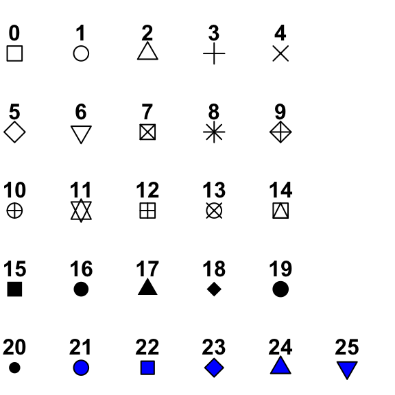
Next, you can change the point shape, colour and size to your taste. Here’s an overview of the different shapes:

plot(iris$Petal.Width, iris$Sepal.Length,
xlab = "petal width", ylab = "sepal length",
main = "petal width vs sepal length",
pch = 16,                                                 #change shape of data points
cex = 0.4,                                                #change size of data points
colour = "black")                                         #change colour of data points
Now, we want to add our fit to the data. For this we will use the command abline. Abline(a,b) draws a straight line with intercept a and slope b. You can also change the colour, width and line type of abline. Here’s an overview of the different line types available:

plot(iris$Petal.Width, iris$Sepal.Length,
xlab = "petal width", ylab = "sepal length",
main = "petal width vs sepal length",
pch = 16,
cex = 0.4,
colour = "black")
abline(fit,                                               #drawing a line with the coefficients of fit
       colour = "red",                                    #change colour of line
       lty = "solid",                                     #change line type
       lwd = 1)                                           #change line width
Now, last but not least, we would like to add a legend showing the adjusted r squared value of the fit. We can extract this information from the fit summary.
#summary of lm fit
summary_fit <- summary(fit)
#get adjusted R^2 value
r2 <- summary_fit$adj.r.squared
#create a legend text
mylabel = bquote(italic(R)^2 == .(format(r2, digits = 3)))   #bquote enables us to use mathematical expressions, digits = 3 rounds the                                                                  #result to 3 decimal places.
legend('topleft',                                            #defines position of legend
       legend = mylabel,                                     #define text for legend
       cex = 0.7,                                            #define size of legend
       bty = "n")                                            #"n" = no boxline for legend, "o" = boxline for legend
That’s it, your first plot in R!

In some cases, it can be helpful to manipulate the x and y axis. For examples, you can set boundaries or log transform the axis.
#changing axis
plot(iris$Petal.Width, iris$Sepal.Length,
    xlim = c(0,12),                                        # xlim = c(boundry_left, boundry_right)
    ylim = c(0,12))                                        # ylim = c(boundry_down, boundry_up)

#log transformation
plot(iris$Petal.Width, iris$Sepal.Length,
    log = "x")                                             #transforming x axis. use log = "xy" to transform both
Exercises
Go back to the swiss data set and use the functions you have learned to find the best correlation between variables
Use linear regression to model the relationship between the two variables and determine its significance
Present your result with a suitable plot