Metagenomics II
General information
In this practical session, we will explore approaches and concepts for comparing the differences between samples, in line with the content of the second lecture.
More specifically, we will:
Compare differences between samples using beta-diversity indices
Visualise differences in beta-diversity using Principle Coordinates Analysis (PCoA)
Explore differential abundance testing
Learn how to apply a random forest model
Resources
Exercises within the Metagenomics II section require the use of the R-Studio on cousteau: http://cousteau-rstudio.ethz.ch/
Exercise 1: Compare differences between samples using beta-diversity indices
For the first exercise today, we will work with a dataset of 480 gut microbiome samples. The samples were collected from 120 individuals, with each being sampled four times over the course of one year.
The dataset is derived from a study published by Sowah et al., (2022) in Genome Med.
Instead of working with an OTU taxonomic profile, like in Metagenomics I, this dataset has already been aggregated at the genus level.
Therefore you will work with a genus-level taxonomic profile.
You can load the dataset in R with:
load(url("https://zenodo.org/record/7188406/files/human_microbiome_dataset.Rdata"))
This will download:
tax_profile, contains a taxonomic profile at the genus levelmetadata, contains the metadata for the samples
Firstly, we need to load two packages that will be used to calculate beta-diversity and visualize the results:
library("vegan")
library("ggplot2")
Prior to comparing the microbial communities between samples, we would like to rarefy the data, to remove biases introduced by sequencing depth.
Based on what you learnt in Metagenomics I, can you rarefy the dataset?
# First, we calculate the sum of reads in each sample using ColSums and
# can then `sort` the values and print the top few lines using `head`
head(sort(colSums(tax_profile)))

# Based on these, we could rarefy our samples to 6000 reads each
tax_profile_rarefied = t(rrarefy(t(tax_profile), 6000))
Calculating Beta diversity
Beta-diversity is a measure of the differences between samples. Beta-diversity indices compare samples in terms of similarity or dissimilarity.
Dissimilarity metrics typically range from 0 - 1. The higher the value, the more dissimilar the communities are.
Most beta-diversity indices can be computed with the vegdist() function from the vegan package. Run ?vegdist to the see the available metrics.
To begin, we will use the Jaccard index that you were introduced to in the lecture:
tax_profile_gut_jaccard = as.matrix(vegdist(t(tax_profile_rarefied), method = "jaccard"))
Exercise Task 1
Explore the Jaccard distance matrix
Q1: What is the structure of the dissimilarity matrix? What properties does it have?
# Take a look at the first 6 samples
tax_profile_gut_jaccard[1:6,1:6]

# We can see that the matrix is symmetrical (i.e. the distance between sample1
# and sample2 is the same as the distance between sample2 and sample1) and that
# the diagonal is zero (i.e. the distance of a sample to itself is zero).
# All values are between 0 and 1.
Q2 Plot a histogram of the dissimilarity values. What is the structure of the histogram? What is the median dissimilarity value?
# Plot histogram using 'hist' function
hist(tax_profile_gut_jaccard)

# Find median value
median(tax_profile_gut_jaccard)
We will now use the Jaccard indices to explore how stable the human gut microbiome is over time and how different it is between individuals.
Therefore we will perform two comparisons: same individual over time (within-subject), and different individuals at time point zero (between-subject):
# Firstly we wll create a blank list that we can fill with values during comparison
same_subject_jaccard = c()
different_subject_jaccard = c()

# We will now use a 'for loop' to loop over the dataset
for(subject in unique(metadata$Subject)){
    #-------------------------------------------------------------------
    # Compare the first (T0) and last samples (T3) for each individual,
    # i.e. within subject comparison over one year

    # To do this we will extract the T0 for each subject from the rows of the
    # Jaccard matrix and the T3 for each subject from the columns of the matrix
    t0_vs_t3 = tax_profile_gut_jaccard[paste0(subject,"_T0"), paste0(subject,"_T3")]

    # Now append these to the empty list
    same_subject_jaccard = c(same_subject_jaccard, t0_vs_t3)

    #------------------------------------------------------------------
    # Compare the T0 of this subject to the T0 of all other subjects

    # First create a list of identifiers for subjects at T0
    all_samples_at_t0 = paste(unique(metadata$Subject), "_T0", sep = "")

    # Then select one subject at T0
    this_subject_t0 = paste0(subject, "_T0")

    # Extract the single subject versus all subjects at T0 from the Jaccard matrix
    sel_beta_between = tax_profile_gut_jaccard[this_subject_t0, all_samples_at_t0]

    # Remove self-sample matches
    sel_beta_between = sel_beta_between[sel_beta_between != 0]
    different_subject_jaccard = c(different_subject_jaccard,sel_beta_between)
}
Exercise Task 2
Assessing the differences in beta-diversity
Now, all the within-subject distances are in same_subject_jaccard and all the between-subject distances are in different_subject_jaccard.
Task: Combine the same_subject_jaccard and different_subject_jaccard into a single dataframe.
# Extract the Jaccard distances from the two sets and place them in a dataframe, including
# a column to indicate the source of the values, e.g. 'within-subject'
same_vs_different_df = data.frame(
    jaccard = c(same_subject_jaccard, different_subject_jaccard),
    type = c(rep("Within-subject", length(same_subject_jaccard)),
    rep("Between-subject", length(different_subject_jaccard)))
    )
Q1: Do you expect differences between the ‘within-subject’ and ‘between-subject’ Jaccard distances? What will those differences look like? Visualise the differences and compare the median values.
# Visualise the differences between 'within-subject' and 'between-subject' dissimilarities
ggplot(same_vs_different_df,aes(type,jaccard)) + geom_boxplot() +
xlab("") + ylab("Jaccard index")

# Compare the median values
median(same_subject_jaccard)
median(different_subject_jaccard)
Exercise 2: Compare samples using Principle Components Analysis and Principle Coordinates Analysis
The primary aim of ordination is to represent multiple objects in a reduced number of orthogonal, i.e. independent, axes. Ordination plots are particularly useful for visualising the (dis-)similarity among objects. For example, in the context of beta-diversity, samples that are closer in ordination space have a lower dissimilarity, and thus have more similar species assemblages than samples that are further apart in ordination space.
For the remainder of this session, we will work with a new dataset.
The dataset we will use is derived from a study published by Obregon-Tito et al., (2015) in Nature Communications. The study generated taxonomic profiles of gut microbiome samples from two populations, hunter-gatherers from traditional agriculturalist communities in Peru and urban-industrialised communities from the US.
In total, 89 individuals were sampled.
For the exercises here, we have already prepared the taxonomic profile for you, from the original publicatoin data. The profile is a species taxonomic profile.
The data can be loaded with:
load(url("https://sunagawalab.ethz.ch/share/teaching_milanese/data_practical2.Rdata"))
This will load two matrices:
tax_profile_gut, contains a taxonomic profile at the species levelmeta_gut, contains the metadata for the samples
Taxonomic profile
The tax_profile_gut is a profile of the species identified in the samples. The abundances of the species are expressed in relative terms (relative abundance), with values ranging from 0 - 100.
Visualise the first few rows and columns of the profile (tax_profile_gut[1:3,1:3]):
                             HCO02    HCO07    HCO09
Prevotella copri          19.24827  6.67434 41.36079
Catenibacterium mitsuokai 10.52756  4.51712  4.53144
Collinsella aerofaciens   10.31782 18.51913  8.37266
Metadata
The meta_gut contains information about the geographical origin of the individuals that were sampled.
We will compare the human gut microbiome of urban-industrialised people from the US (labelled as "westernised") to the human gut microbiome of hunter-gatherer and traditional agriculturalist communities in Peru (labelled "non-westernized").
Ordination
There are various ordination techniques that can be applied to multivariate biodiversity data. Among the most common, and the one we will use today, is Principal Component Analysis (PCA).
Note
Principle Components analysis explained
PCA is one of the oldest ordination techniques - you may already have used it in previous courses. It is based on linear transformation of the data. It works by calculating linear lines of best fit that capture the variance between the datapoints. These are referred to as ‘Principle Components’ (PC). After the first PC, a second one will be introduced to capture the most amount of variance that couldn’t be captured by the first. This process is iterated until all variance is explained. The PCs are orthogonal to one another and represent axes of variability. The PCs can be used to ordinate differences between sample points in terms of Euclidean distances.
Let’s perform a PCA using the prcomp function and visualise the results.
# The prcomp function, by default, performs comparisons between rows of the matrix
# As we have samples as columns and not rows, we will transpose the matrix when calling it using 't()'
tax_profile_gut_pca <- prcomp(t(tax_profile_gut), center = T, scale. = F)
Now let’s plot the first two components of the PCA, and color the sample points by the categories provided in the metadata vector ("westernised" or "non-westernised"):
# Extract the coordinates of samples on the first two PC's
# Here we are accessing the output of 'prcomp', which contains a dataframe of all PC values, and using index positions
# to select column 1 and 2 that correspond to PC1 and PC2.
# We then add the metadata information based on matching names
data_pca = data.frame(
  first = tax_profile_gut_pca$x[,1], # Extract PC1 values
  second = tax_profile_gut_pca$x[,2], # Extract PC2 values
  type = meta_gut[colnames(tax_profile_gut)]
)

# Extract the eigen values.
# Eigen values tell us the amount of variance explained by each PC
eigs <- tax_profile_gut_pca$sdev^2

# Calculate the proportion of variance captured by the PC1 and PC2 axes (this is the amount of variance captured by a single PC in relation to that captured by all PC's)
p1_e = formatC(  ((eigs[1] / sum(eigs))*100)  , format="f", digits=2)
p2_e = formatC(  ((eigs[2] / sum(eigs))*100)  , format="f", digits=2)

# Visualise the PCA using ggplot
ggplot(data_pca,aes(first,second,col = type))+
  geom_point()+
  xlab(paste0("PC1 [",p1_e,"%]")) +
  ylab(paste0("PC2 [",p2_e,"%]"))+
  theme_bw()
Note
Is PCA a good method to investigate differences in ecological/biodiversity data?
PCA can only evaluate Euclidean distances.
Euclidean distances are often not suitable for direct comparisons in Ecological/biodiversity abundance data. There are several reasons for this, two of the key ones are:
1) With the Euclidean distance, all values are treated equally, including zeros and non-zeros. Therefore, two samples that share many zeros, will appear more similar to each other then samples that share a similar composition of species that are present. This is commonly referred to as the ‘double-zero inflation’. In ecological/biodiversity data, zeros do not necessarily mean absence. They may mean that you didn’t sample enough to observe a species. Therefore, the emphasis of comparison should be on the detected species and not the ‘missing species’.
2) Ecological data is often non-normally distributed, i.e. lacks equal variance around the mean. One of the key assumptions of Euclidean distances is that the data is normally distributed. Without such a distribution, the resulting dissimilarities between samples can be disproportionate.
Therefore, we typically use other dissimilarity measures for comparing abundance data, which are not bound by the same limitations, e.g. Jaccard or Bray-curtis. When using these dissimilarity indices, a more suitable ordination method for visualising the differences is a Principle Coordinates Analysis (PCoA).
Note
Principle Coordinates Analysis explained
The Principle Coordinates Analysis (PCoA) is a method to display the structure of distance-like data in a low dimensional space.
Therefore, it is particularly well-suited to visualise differences in (dis-)similarity. The aim of the PCoA algorithmn is to reduce dimensionality while preserving the distances between sample points.
We will now employ a PCoA to compare the differences between the gut microbiome samples. Earlier, we used the Jaccard index to compare samples.
Now, we will use the Bray-Curtis index. Bray-Curtis is the most commonly used indices for abundance data analysis.
What is the main difference between Jaccard and Bray-Curtis?
Jaccard indices are based on ‘presence/absence’
Bray-Curtis compares the relative abundance of each species between samples and ignores ‘double-zeros’, i.e. it compares the proportional composition of present species
Exercise Task 3
Calculate Bray-Curtis and perform PCoA analysis:
First, we need to calculate a Bray-Curtis dissimilarity matrix. This can be done using the same vegdist function, which we used for calculating Jaccard distance before.
Task: Calculate the Bray-Curtis dissimilarity matrix using the vegdist function.
# Simply change the 'method` part of the call to ``vegdist``
tax_profile_gut_bray = as.matrix(vegdist(t(tax_profile_gut),method = "bray"))
Now let’s visualise the Bray-Curtis dissimilarities using a PCoA. PCoA can be performed with the cmdscale function.
Task: Perform a PCoA analysis on the Bray-Curtis dissimilarity matrix using the cmdscale function.
tax_profile_gut_pcoa = cmdscale(tax_profile_gut_bray)

# Check the structure of the output
head(tax_profile_gut_pcoa)

# As you can see, columns 1 and 2 represent the coordinates of samples along the two PCoA axes
Task: Using the same approach as for the PCA, extract the necessary information from the PCoA output and visualise the ordination.
# Extract information on samples coordinates along PCoA1 and PCoA2 and combine with metadata
data_PCoA = data.frame(
  first = tax_profile_gut_pcoa[,1],
  second = tax_profile_gut_pcoa[,2],
  type = meta_gut[rownames(tax_profile_gut_pcoa)]
  )
# Visualise the PCoA using ggplot
ggplot(data_PCoA, aes(first, second, col = type))+
 geom_point()+
 xlab(paste0("PCoA1"))+
 ylab(paste0("PCoA2"))+
 theme_bw()
Exercise 3: Differential abundance testing
The analysis that we have performed so far has been focused on investigating differences between samples at the community-level:
We looked at individual samples (alpha-diversity measures like richness)
We looked at pairs of samples using beta-diversity (like the Jaccard index)
We looked at all samples together in a PCA/PCoA plot.
Now, we will focus on individual species (rows in the taxonomic profile). In particular, we will try to identify if any of the species are differentially abundant between the gut microbiome of westernized and non-westernized humans.
For this, we will employ differential abundance testing.
In order to ensure robustness in our analysis, we will remove species that are not prevalent across the dataset, i.e. only appear in a few samples.
Exercise Task 4
Removing species that have a low prevalence across the dataset
In Metagenomics I you assessed the prevalence of OTUs, we will employ the same procedure here.
Q1: How many species have a prevalence of >20%? Identify those species and remove them from the tax_profile_gut.
# Calculate prevalence, as a percentage, i.e. what proportion of samples does a species appear in.
prevalence = (rowSums(tax_profile_gut > 0) / ncol(tax_profile_gut)) * 100

# How many species have a prevalence of >20%
sel_species = names(which(prevalence > 20))
length(sel_species)

# Using this list of names, let's filter the tax_profile_gut table
tax_profile_gut_subset <- tax_profile_gut[sel_species, ]

# We will now use this subset table for the remainder of the analysis
This filtering step results in 152 species that are sufficiently prevalent across the dataset.
Checking the structure of the data
Before we can proceed with differential abundance testing, we first need to understand the structure of our data.
Exercise Task 5
Assessing the data structure
One of the first steps that is normally performed prior to any statistical analysis is to check the distribution or structure of your data.
Task: Plot a histogram of the ‘tax_profile_gut_subset’.
# Plot a histogram of the relative abundances of all species
hist(tax_profile_gut_subset, 100)

# As there are a lot of zeros, it is hard to see. So let's repeat this with non-zero values only
hist(tax_profile_gut_subset[tax_profile_gut_subset != 0], 100)
This shows us that most of the values in the dataset are very small. To more clearly understand the structure of the data though, we need to see how it is distributed around the mean value. We can achieve this by log-transforming our data and then re-plotting the histogram.
# In R, we can apply a log transformation using the 'log10' function.
# However, log transformation can not be applied to zeros, as log(0) = infinity.
# Therefore, we must apply the transformation to all non-zero values
log_data = log10(tax_profile_gut_subset[tax_profile_gut_subset != 0])

# Now replot a histogram, this time using the 'log_data' as an input
To provide a comparison for reference, below is an image of how a ‘normal’ data distribution looks.
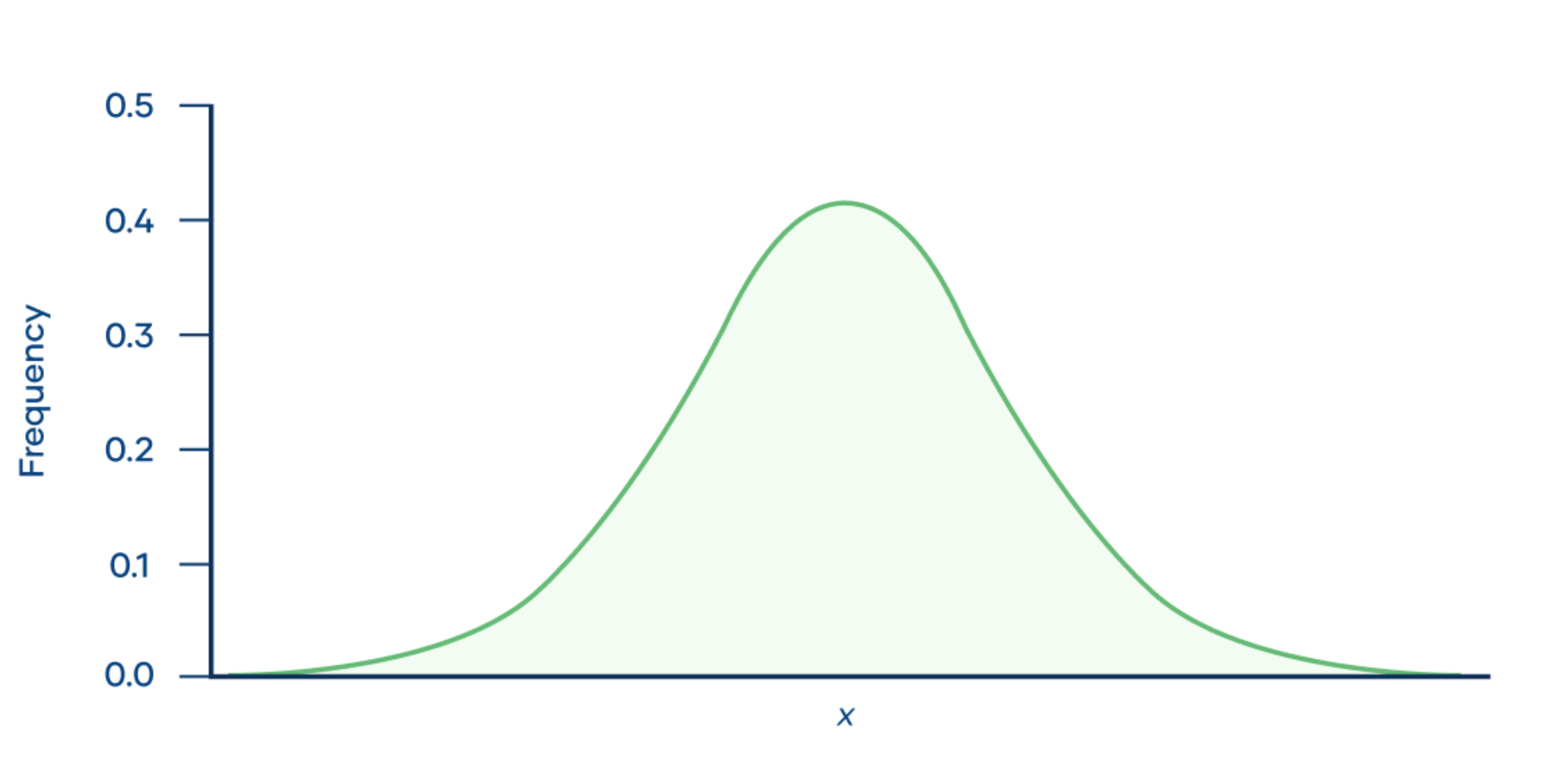
Q2: Compare the log-based histogram with that of the reference. Is the tax_profile_gut_subset data normally distributed?
The tax_profile_gut data shows a non-normal distribution.
Instead of relying only on visual comparison, we can use a well known statistical test for normality: Shapiro-Wilks test.
# A Shaprio-Wilks test can be performed using the 'shapiro.test' function in R.
shapiro.test(tax_profile_gut_subset[tax_profile_gut_subset])

# A p-value <0.05 indicates non-normal distribution
We have now established that our data shows a non-normal distribution.
Q4: How can we proceed with non-normally distributed data?
We can use non-parametric tests, such as Wilcoxon rank sum/Mann-Whitney U.
Wilcoxon rank-sum test (non-parametric)
As the data shows a non-normal distribution, we will proceed with a non-parametric test. In particular, the Wilcoxon rank-sum test (also known as Mann-Whitney U test).
Note
Wilcoxon rank-sum test explained
The Wilcoxon rank-sum test is a non-parametric alternative to the two-sample t-test. As is often the case with non-parametric approaches, it is based solely on the ranked order of observations within samples.
In the case of biodiversity data, the abundances of species in the samples are ranked and the order of species ranks are compared across samples.
Here is the code to compare all westernised vs all non-westernised samples through a Wilcoxon test:
?wilcox.test  # type to learn more about the function

# Extract all of the samples belonging to the 'westernized' group by matching their names in the meta_gut table
west = tax_profile_gut_subset[ , which(meta_gut == "westernized")]

# Extract all of the samples belonging to the 'non-westernized' group by matching their names in the meta_gut table
non_west = tax_profile_gut_subset[ , which(meta_gut == "non-westernized")]

# Now perform a wilcox test
wilcox_results = wilcox.test(west, non_west)$p.value
To apply a Wilcoxon rank-sum test to each species, we can make use of a for loop:
# Create an empty list, of the correct length, that the test results can go into
wilcox_results = rep(NA, length(sel_species))
# Then we assign the species names as the names in the list
names(wilcox_results) = sel_species

# Run through the dataset in a loop, calculate the log10 abundance of each species for each category and then perform a Wilcox test
for(species in sel_species){
    west     = tax_profile_gut_subset[species, which(meta_gut == "westernized")]
    non_west = tax_profile_gut_subset[species, which(meta_gut == "non-westernized")]
    wilcox_results[species] = wilcox.test(west, non_west)$p.value
}
Exercise Task 6
Assess the results of the Wilcoxon tests.
Q1: Which species have the lowest p-values?
# Use 'sort' to arrange the dataframe by p-values, and 'head' to print the bottom few lines of the dataframe
head(sort(wilcox_results))
Q2: How many species show a statistically significant differential abundance between westernised and non-westernised gut mirobiomes?
# how many species have a p-value below 0.05
length(which(wilcox_results<0.05))
Q2: Select the species with the lowest p-value. Can you extract its relative abundance from tax_profile_gut and visualise the difference between the westernised and non-westernised samples as a boxplot?
# Using the name of the species we can retrieve its relative abundance information from the tax_profile_gut_subset
# We can then combine that with the meta_gut file
df_sp_sig = data.frame(
  rel_ab = tax_profile_gut_subset["Flavonifractor plautii", ],
  type = meta_gut)

# Let's now visualise the abundance in the two datasets as a boxplot.
ggplot(df_sp_sig, aes(type, rel_ab))+
geom_boxplot() +
ylab("Relative abundance")+
xlab("")+
ggtitle("Flavonifractor plautii")
P-value correction for multiple testing
As we saw in the lecture, whenever you perform numerous tests on a dataset, you have to adjust the p-value to account for multiple testing.
Let’s correct the p-values and re-evaluate the Wilcox test results
# Here we are using the Bonferonni method for multiple testing correction
adjusted_pvals = sort(p.adjust(wilcox_results, method = "bonferroni"))
Exercise Task 7
Look at the adjusted p-value vector:
Q1: How many species are still significantly differentially abundant after correcting for multiple testing?
length(which(adjusted_pvals<0.05))
Q2: There are also other methods to correct for multiple testing. Check the help (?p.adjust) to find out how to do Benjamini & Hochberg multiple testing correction.
How many species are still significantly differentially abundant after Benjamini & Hochberg correction?
# Here we just change the 'method' specified in the call to p.adjust
adjusted_pvals = sort(p.adjust(wilcox_results, method = "fdr"))
length(which(adjusted_pvals<0.05))
Exercise 4: Build a random forest model
In this exercise, we will model the human gut microbiome of westernized and non-westernized people. In order to do this, we will use the random forest machine learning classifier that was described during the lecture. We will first train the classifier on our dataset and then find what the important features (species) are of the two categories. After this, we will apply the classifier to a new dataset.
# Load necessary libraries
library(randomForest)
library(ROCR)
Build the random forest classifier using the tax_profile_gut dataset along with the categories from the meta_gut:
# The below command is used to build the random model classifier.
# The 'importance' and 'proximity' flags do not impact the model, instead they state that you want this information to be calculated and returned in the output (they are statistics of the model itself)
RF_classifier = randomForest(x = t(tax_profile_gut_subset), y = as.factor(meta_gut), importance = TRUE, proximity = TRUE)

# View the output
# Here you will get a lot of different information, some of the main ones are:
# No. of variables tried at each split: this is an important hyperparameter that influences the accuracy of the model.
# It is the number of different candidates that were randomly tested for each split in the tree
# OOB estimate of error rate: 'Out-of-the-bag' estimated error rate, which is the average estimated error you get for
# each candidate
RF_classifier

# Plot the error rate with number of trees in model
plot(RF_classifier)
# You can see that as the number of decision trees increases, the error rate reduces
We can evaluate the importance of the features (species):
importance <- as.data.frame(RF_classifier$importance)
head(importance[order(importance$MeanDecreaseAccuracy, decreasing = TRUE), ], n = 10)
Does the importance of species agree with the results from the differential abundance testing? Is Flavonifractor plautii at the top of the list?
We will now use the classifier to try and classify new samples, i.e. can we predict whether the samples are from westernised or non-westernised individuals?
Here we provide you with some samples that were not used before for training.
load(url("https://sunagawalab.ethz.ch/share/teaching_milanese/data_practical2_test_RF.Rdata"))
This will load new_data and meta_new_data.
Lets use our random forest classifier to predict new samples. This will be done using the predict function.
# Perform predictions on the new data using the generated Random forest model classifier
# Here we have specified the 'prob' to provide us with the probabilities of
# classification into each class
applied_RF_output <- as.data.frame(predict(RF_classifier, t(new_data), type="prob"))

# Let's assign the category to each sample based on highest probability
applied_RF_output$predict <- names(applied_RF_output)[1:2][apply(applied_RF_output[,1:2], 1, which.max)]

# Add the real categories to the data frame
applied_RF_output$observed <- meta_new_data

# Now view the result
applied_RF_output
Exercise Task 8
Assess the output of the Random Forest Classifier
There are many measures that can be used to evaluate the performance of a random forest classifier. Here, we will introduce you to two of the most common methods.
Firstly, we will create an ROC curve (Receiver Operating Characteristic), which allows us to visually see the rate of false-positive to true-positive predictions.
# The first step in evaluating the output of 'predict' is to standardize the format, so that it can be used to assess different measures.
# This is done using the 'prediction' function from the 'ROCR' package.
applied_RF_output_pred <- prediction(applied_RF_output[,2], as.factor(meta_new_data))

# Now we can make use of the 'performance' function, from the same package, to evaluate the performance of our classifier
# Here, we specify the measures that we are interested in, 'tpr' = true positive rate, and 'fpr' = false positive rate
# We can the create an ROC curve from this.
roc.perf = performance(applied_RF_output_pred, measure="tpr", x.measure="fpr")
plot(roc.perf)
abline(a=0, b= 1)
Following the above code, should generate a plot that looks similar to the one below (without using seed, the results will also vary slightly).
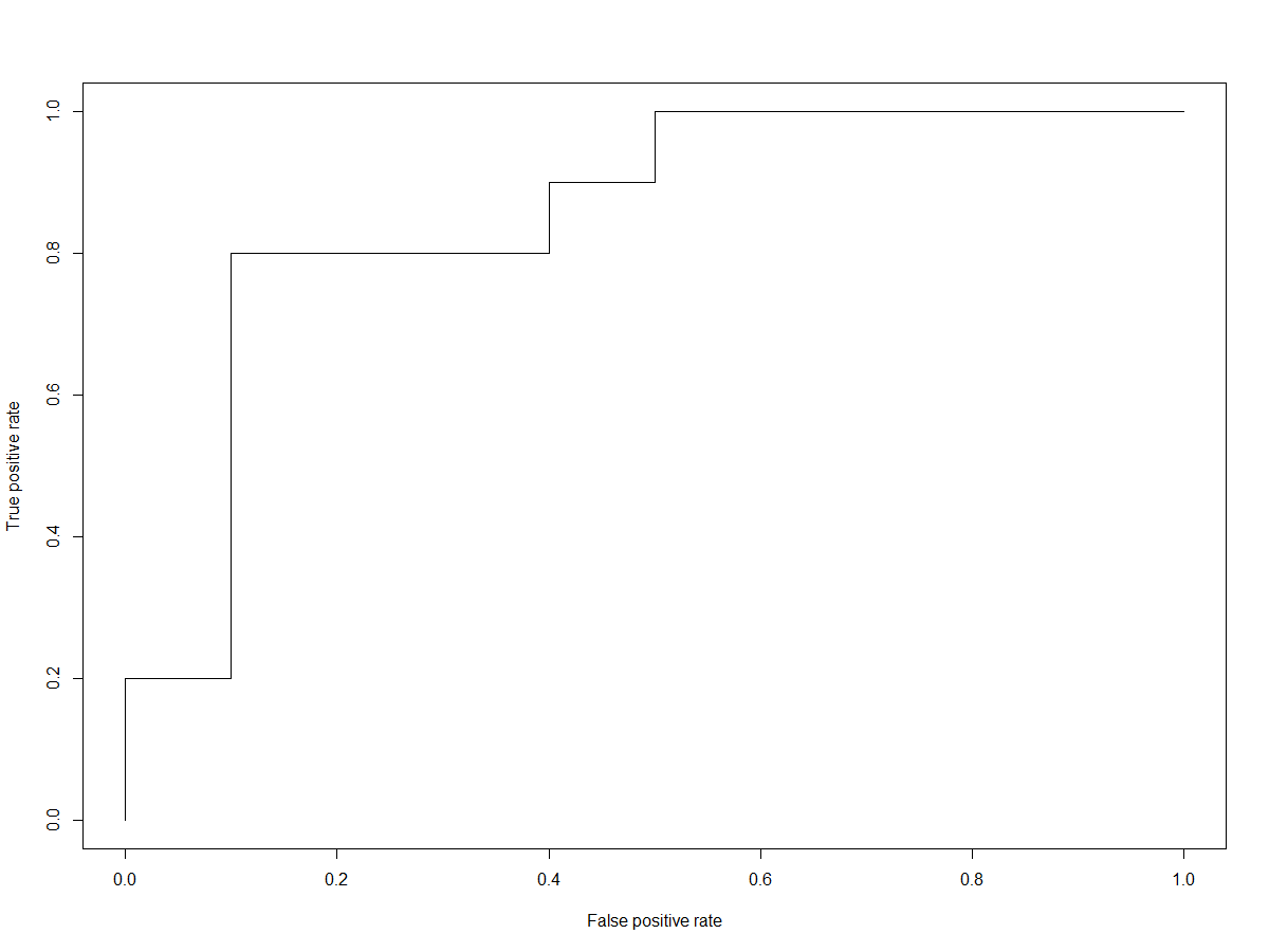
One of the metrics used to measure the performance of a random forest classifier is derived from this information, and called the ‘Area Under Curve’ (AUC). The AUC is pretty self-explanatory, it provides a numerical value of the area under the curve, whereby 1.0 would be 100% true positives and 0% false positives.
Let’s calcualte the AUC.
# We can again employ 'performance' here, specifying 'AUC' as the measure of interest
performance(applied_RF_output_pred, measure="auc")@y.values[[1]]
Another way to assess the predictions of a random forest classifier is through a confusion matrix.
Let’s generate the confusion matrix
# Calculate a confusion matrix - a summary of the frequency of
# accurate and inaccurate predictions
applied_RF_class_confusion_mat <- table(applied_RF_output[,3:4])
applied_RF_class_confusion_mat
Q1: What do the values in the confusion matrix mean? What can we derive about the classifier from this matrix?
Note
Evalutating the statistics of Random Forest Classifier models
In the above exercises, we asked you to evaluate some of the Random Forest Classifier model statistics, such as the confusion matrix and the AUC.
Here is a slightly more detailed description of these metrics:
Confusion: The confusion matrix is a way of expressing the performance of the classifier. It includes the number of correct predictions and for incorrect predictions, it informs us about where the model was ‘confused’. In the confusion matrix, the rows represent the predicted labels and in the columns, the true labels. The numbers on the diagonal inform us of how many times the predicted labels matched the true labels. The other values indicate the number of times the classifier mis-labeled.
AUC: The AUC is a metric that quantifies the accuracy of prediction. That is, the ability of the model to distinguish true positives and true negatives. In the exercise, we got you to visualise the ‘ROC’ curve. The AUC is the area under the curve. It is a value that ranges from 0 - 1, with 1 being a perfect model classifier performance.
Note
Using a Random Forest Classifier with more than two categories
The above provided code for training and applying a random forest classifier in R is a very simplified version.
There are many aspects that would be considered and included in a more thorough analysis, such as tuning the hyperparameters.
In addition, the above code will only work for binary classifications (e.g. two categories).
In instances where you have more than two potential classifications (Such as metagenomics project I), the code becomes a bit more extensive. You need to employ a for loop, to calculate the different statistics.
Below, is an executable function that you can use to generate all of the necessary statistics when you have more than two classes/categories. Copy and paste the code below and run it in your R.
getROC <- function(RF,newdat,fct){
 # Run the prediction on the new dataset
 prediction_for_roc_curve <- predict(RF,newdat,type="prob")
 # Store the real categories for each sample as a character list
 true.values <- as.character(fct)
 # Convert prediction probabilities into classifications and store as character list
 pred.values <- as.character(apply(prediction_for_roc_curve,1,function(x){names(x)[which.max(x)]}))
 # Save predict output to dataframe
 tmp <- prediction_for_roc_curve
 # Add in column names
 colnames(tmp) <- paste("prob.",colnames(tmp),sep="")
 # combine the real categories with the predicted categories and the prediction probabilities into single dataframe
 pred.mat <- data.frame(true=true.values,predicted=pred.values,tmp)
 # Calculate a confusion matrix from the real categories and predicted categories
 conf.mat <- table(true.values,pred.values)

 # Define empty variables to be filled
 fpr <- NULL
 tpr <- NULL
 auc <- NULL
 fct_lev <- NULL
 # Loop through each category
 for (i in levels(fct)){
  # Loop through each category and convert to binary form, e.g. 1 or 0, in the correct order they appear in the input
  true_values <- ifelse(fct==i,1,0)
  # For the category in question, combine the prediction probability and the true binary value in standardized format
  pred <- prediction(prediction_for_roc_curve[,i],true_values)
  # For the category in question, run a performance, calculating the true-positive rate (tpr) and false-positive rate (fpr)
  perf <- performance(pred, "tpr", "fpr")
  # Extract the values from the performance and place in a list
  fpr <- c(fpr,unlist(perf@x.values))
  tpr <- c(tpr,unlist(perf@y.values))
  # Calculate the AUC metric
  auc <- c(auc,unlist(performance(pred, measure = "auc")@y.values))
  # Extract the value and place in a list
  fct_lev <- c(fct_lev,rep(i,length(unlist(perf@x.values))))
  }
 # Combine the different calculated metrics and place in a dataframe
 roc.df <- data.frame(fpr,tpr,fct_lev)
 names(auc) <- levels(fct)
 # create a list of dataframes based on all the calculated metrics
 list(conf.mat=conf.mat,pred.mat=pred.mat,ROC=roc.df,AUC=auc)
}